
The Mission: Overhaul Circl Brain Health's mobile app.
The existing app suffered from usability problems, confusing jargon, and inconsistent design. The goal was to create a more intuitive and visually cohesive experience while designing a new feature for tracking lifestyle goals and their impact on brain health.
Circl Brain Health is a neurotechnology leader specializing in brain-computer interfaces. Their flagship product combines an EEG-powered headset with a mobile app.
As Lead Designer, I collaborated directly with the CTO, CEO, and the development team.

The app was a powerful, but using it felt like navigating a complex and dated cockpit.
The added challenge: designing a new feature for tracking lifestyle goals (sleep, exercise, etc.) and visualizing their impact on brain health.

A deep dive into the existing app, including a heuristic evaluation and UI audit, focusing on accessibility, content, and visual consistency.
Identified issues:
Defining essential design styles laid the groundwork for a purpose-built semantic design system.

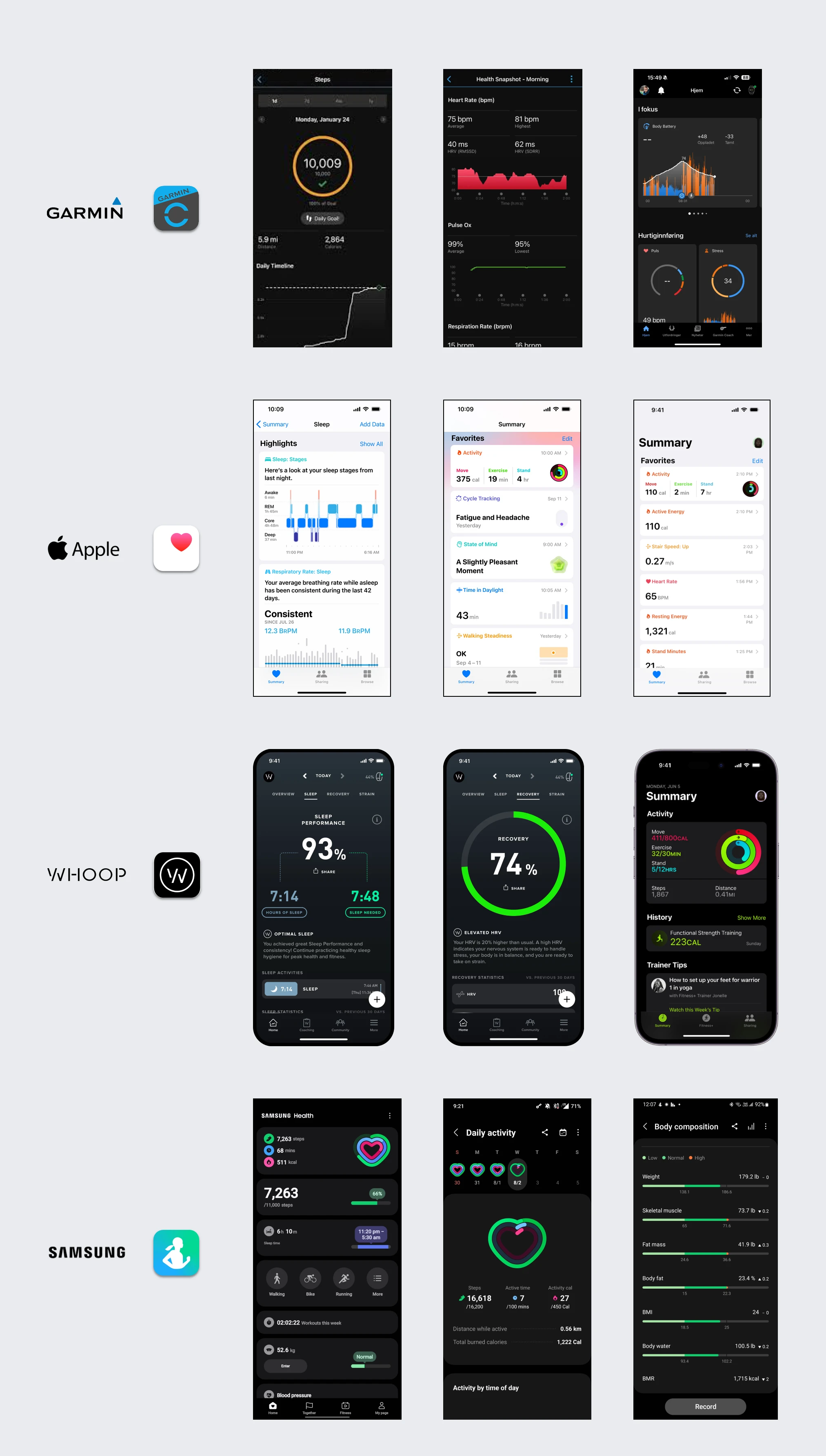
Researched leading health apps such as Garmin Connect, Apple Health, Whoop, and Samsung Health.
The goal: identify common design patterns and gather inspiration.
Built using the OKLCH color space.
Included neutrals, brand colors, brand shifts, and semantic colors.
Extended variations at extreme light and dark ends for subtle surface shading and typography.
The final palette was imported into Figma as local variables.


A perceptually uniform color space ensures consistent appearance across brightness levels. Ideal for accessible interfaces.
Fine-grained control over lightness, chroma, and hue. Helps maintain visual harmony, improve readability, and ensure WCAG compliance.
Built foundational components using variants and variables for easy updates:

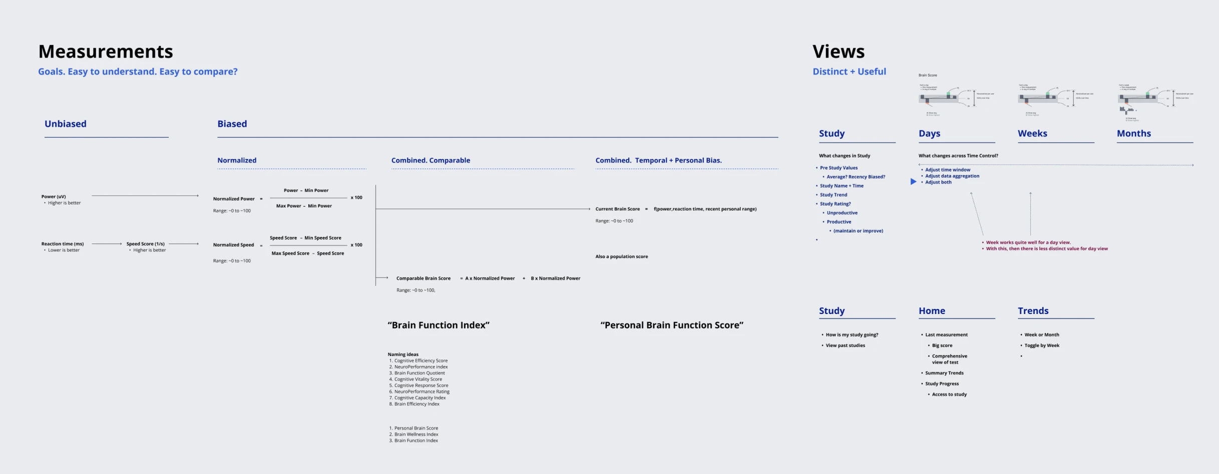
Focused on the key brain health trend graph (test results over time, highlighting performance).
Experimentation: bar charts, dot plots, line graphs, shaded fills, trend line overlays. Also considered representing multiple tests on a single day. Team preference: "over-under" bar charts combined with a trend line. Refined live during meetings.

Refined brain performance and brain wave distribution charts, enhancing clarity with axes, legends, and range highlights.
Explored test comparison methods and aligned the team on the most effective styles.

Explored iconography for the 'Start Test' call to action.


The Start Test icon was brought to life with a refined, subtle animation. A gentle pulse effect was introduced, where the center wave grows and brightens, then smoothly radiates outward.
The animation begins with no initial velocity, builds up to a linear motion as the pulse expands, and concludes with a soft ease-out to create a natural stopping point.
A brief pause between cycles ensures the animation remains tasteful and non-distracting.
The timing and motion curves were carefully tuned to achieve a balanced effect—noticeable yet subtle, polished, and never overwhelming.
Mapped information architecture, reviewing content to clarify complexity and set goals for clear, comparable measurements and distinct views.
Refined card styles and interaction patterns, favoring direct tap-to-advance over a ‘Next’ button to reduce steps.
Polished layouts for clarity, spacing, and hierarchy.
Used ChatGPT prompts to clarify study workflow text, explaining activity benefits.
Prototypes were reviewed and finalized through team feedback.


Multiple options for first- and second-level navigation were considered, balancing clarity, accessibility, and future scalability.
Collaborative reviews finalized a structure that kept the design clean and straightforward.

Real-world scenarios tested chart clarity for various user behaviors (new, inconsistent, daily).
Different time ranges (7 days to 1 year) and data granularities confirmed the design’s adaptability and responsiveness.

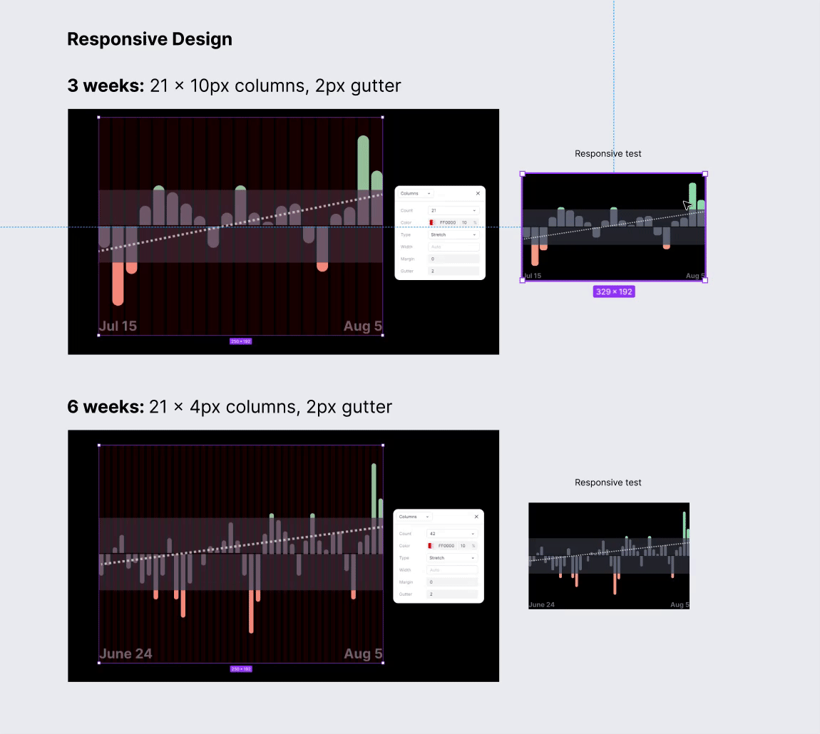
Using Figma's layout grids, calculated gap spacing, widths, and chart dimensions to ensure responsiveness across different screen sizes.
Vetted the chart resonsive design against the minimum phone width to guarantee usability on smaller devices. This approach allowed the charts to scale seamlessly while maintaining consistent spacing and visual clarity.
This level of precision and adaptability reflects the attention to detail that defines my work.
A precise 8-pixel base spacing system guided construction of the gauge chart.
Each component was modifiable, responsive, and ready for future animation.
This geometric rigor reinforced a balanced, professional look.

The team aimed for an introductory animation that explained the outer gauge ring’s function without clutter.

A large, dynamic gauge number was proposed to animate upward. This was simple to implement in the mobile app, though the Figma prototype did not include the animation to keep it lean.

A glowing curtain reveal animation for brain waves added polish. Due to development priorities, it was not included in the final product.

Key screen elements solidified: header, gauge chart, waveform display with legend, and a call-to-action for new studies.
The team embraced a full-bleed waveform that underscored the EEG headset’s capabilities.
Navigation moved downward to spotlight the hero elements (main chart and waveform).

Menu content underwent simplification to reduce cognitive load. Interaction styles (push, overlay, move-in) were tested, and overlay emerged as the preferred approach.
Subworkflows for terms of service, privacy, and data deletion were also defined.

Updates focused on the new visual language and cohesive text, images, and call-to-actions.
Alternative layouts were explored.

Turning complexity into an intuitive experience defined this redesign. Foundational issues were addressed, a robust design system established, and every detail thoughtfully crafted.
The result: a streamlined, engaging mobile app that helps Circl lead in brain health monitoring.
Notable upgrades included the refined main gauge, accessible data visualizations, intuitive navigation, and polished study/test workflows.
This cohesive, high-quality design lays the groundwork for continued innovation in brain health solutions.
